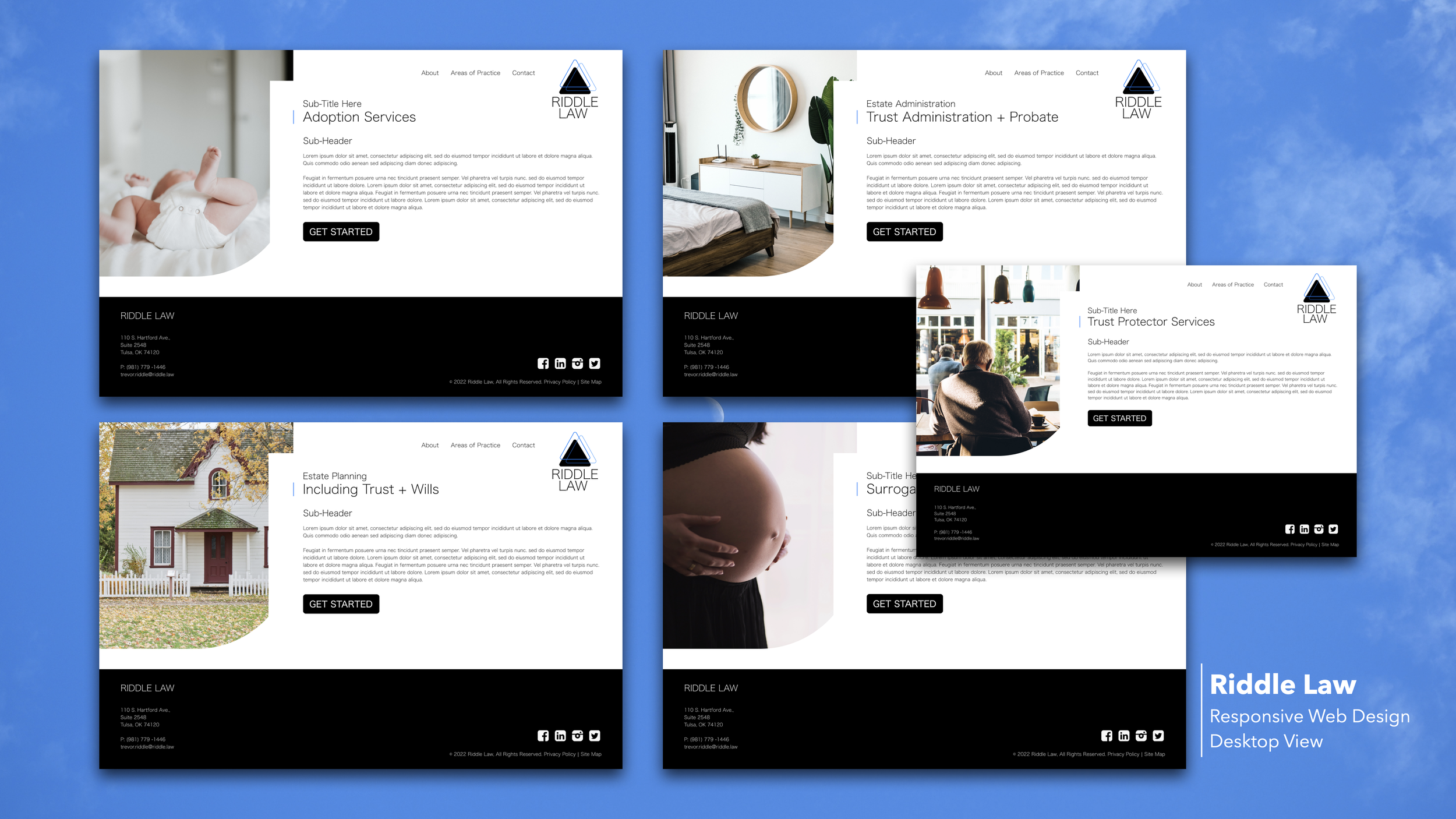

Trevor Riddle came to me with a great attitude, a vibe and a new business. It was clear that he wanted something unique in the law world. He’s not your average lawyer and your average site simply would not do. He needed something unique that would speak to a younger crowd but not isolate older folks. Something clean, modern and easy to navigate. A site that makes you feel something while you are engaging with it. Something fun and fresh that boasts local pride.
I think it’s safe to say we accomplished our goal.
Riddle Law
UI/UX | Web Design | Brand Voice + Tone | Image Sourcing Original Logo Design
Responsive Website *In Development | Publish Date October 2022
Original Logo Design
The client wanted something more than just typography, but still wanted to keep things simple, modern and clean. These are some concepts I came up with before we eventually settled on a direction.
Bellow: Desktop Screens

“It has exceeded my expectations, and that is saying something. My standards were set pretty high to begin with”
— Trevor Riddle

Responsive Screens
I always design with a mobile first mindset. Your mobile screen is in many cases the most viewed screen and is your most challenging screen overall to design due to the size (or lack there of). The mobile first mindset always makes sure that your designs are user centered and allow for the highest conversion rates.
Bellow are the Tablet/Mobile Screens.


