Brand Guidelines | Voice + Tone | Image Sourcing
Responsive Website Design | UI/UX
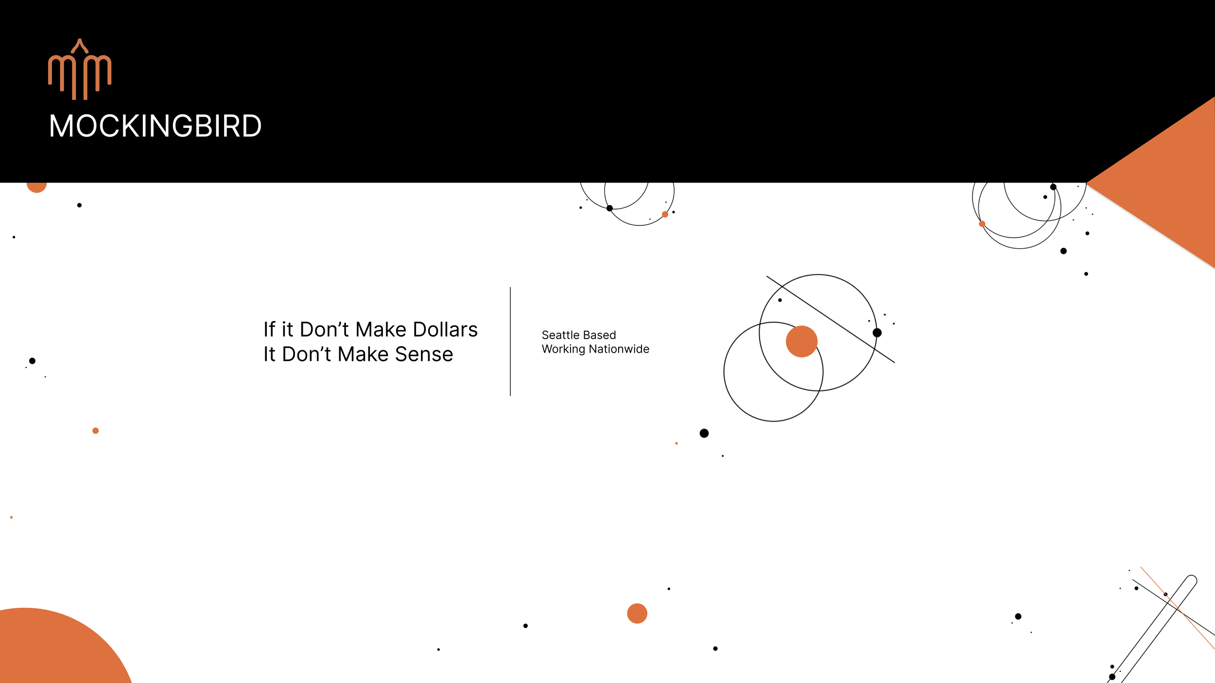
MOCKINGBIRD is a full service, digital marketing agency that focuses solely on the legal field. As the Lead UI/UX designer I workd directly with clients on various projects from websites (varying in scope from complete redesigns, refreshes, built from scratch, additions, etc), ads (print, digital and social), brand packages, logo creation + redesigns, and so on...
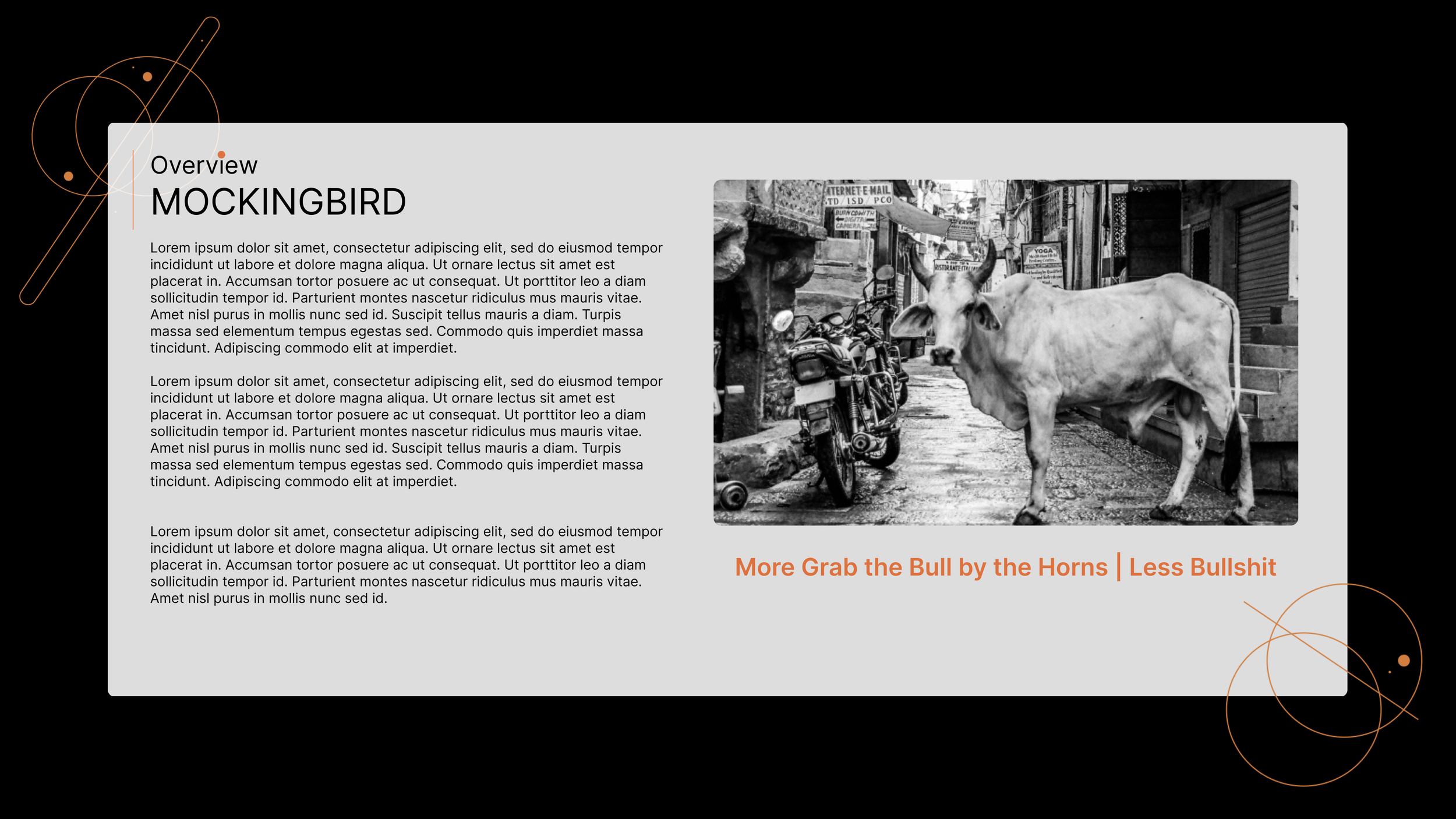
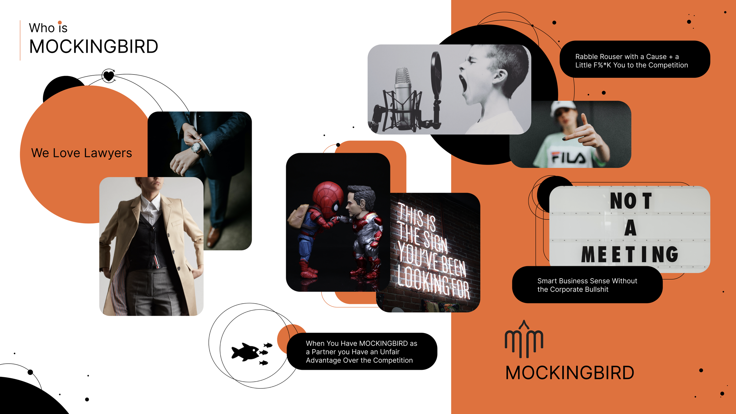
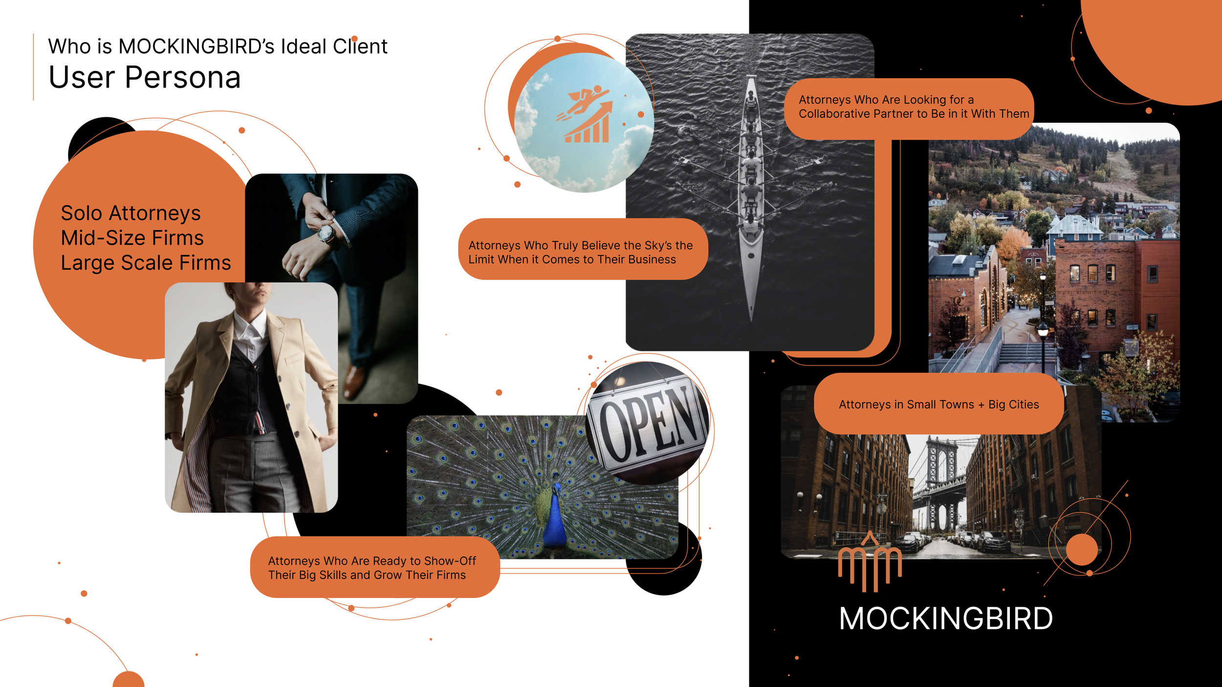
I had the opportunity to set (or rather reset) the voice + tone of our house brand with the creation of brand guidelines and a compete website redesign, with the only thing carrying over from the existing brand being the rabble rouser, counter-culture persona and the logo. This is the outcome of that creative experience.
Who is MOCKINGBIRD?
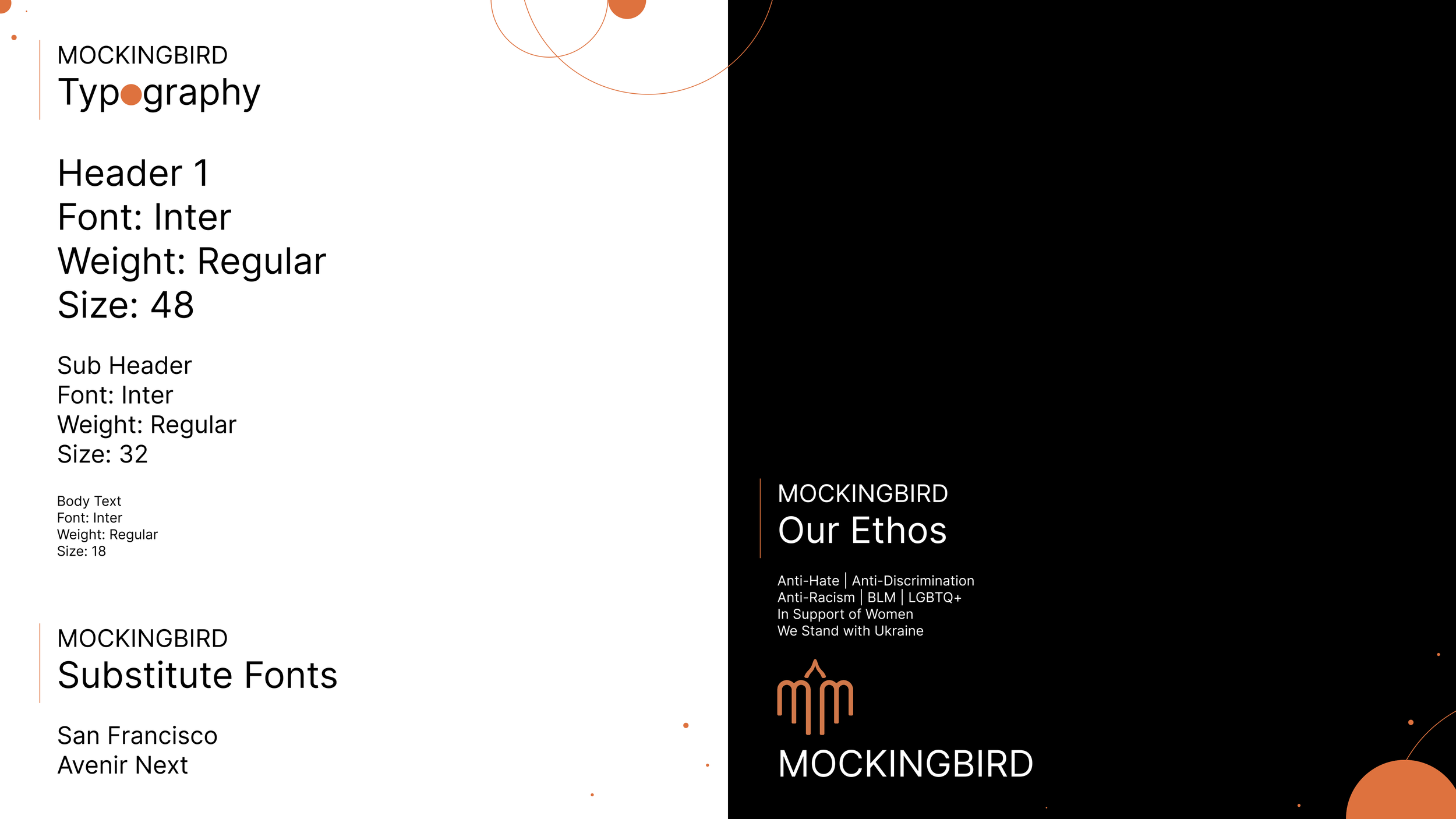
Brand Guidelines | Voice + Tone
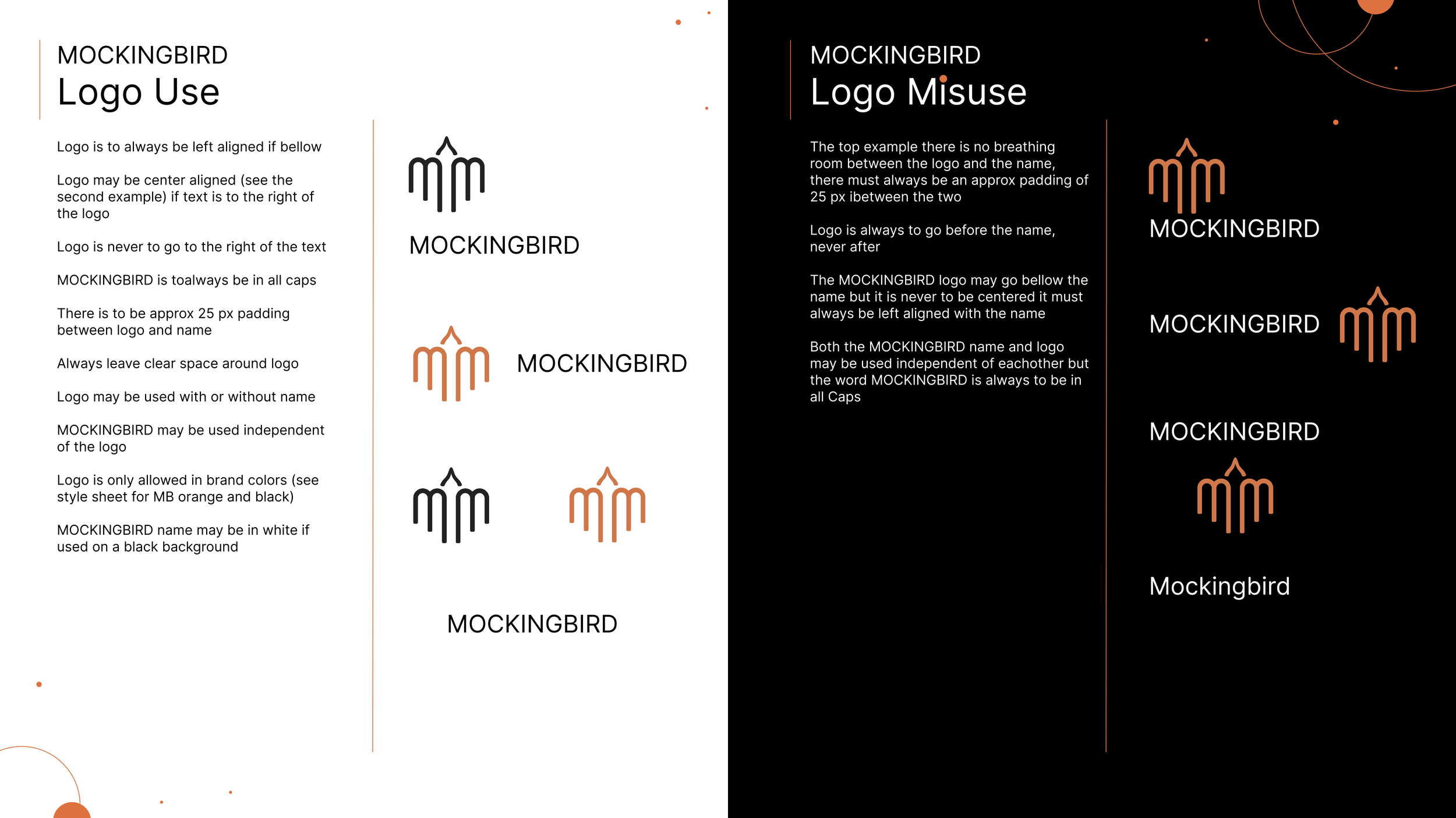
Style Sheet | Logo use + Misuse



Making a Good 1st Impression
1/10th of a second, that is all it takes for your user to decide what they think of you, your business and your website (or all of the above). Having a website that properly represents your business is so important, often it is the first time I customer will interact with your business, first impressions matter. When I first came to MOCKINGBIRD their website was tired and old. It was in desperate need of a lifeline. It did not make sense for us to be talking to clients about upgrading their sites while ours was in need of some major updating itself. I was happy to take this project on, not only did it give me the opportunity to showoff my big skills and properly represent my employer, it allowed us to really become a player in the digital marketing world, to put our money where our mouth is so to speak and to follow our own advice.
*MOCKINGBIRD Website is currently in the development phase & is scheduled to launch mid November 2022!
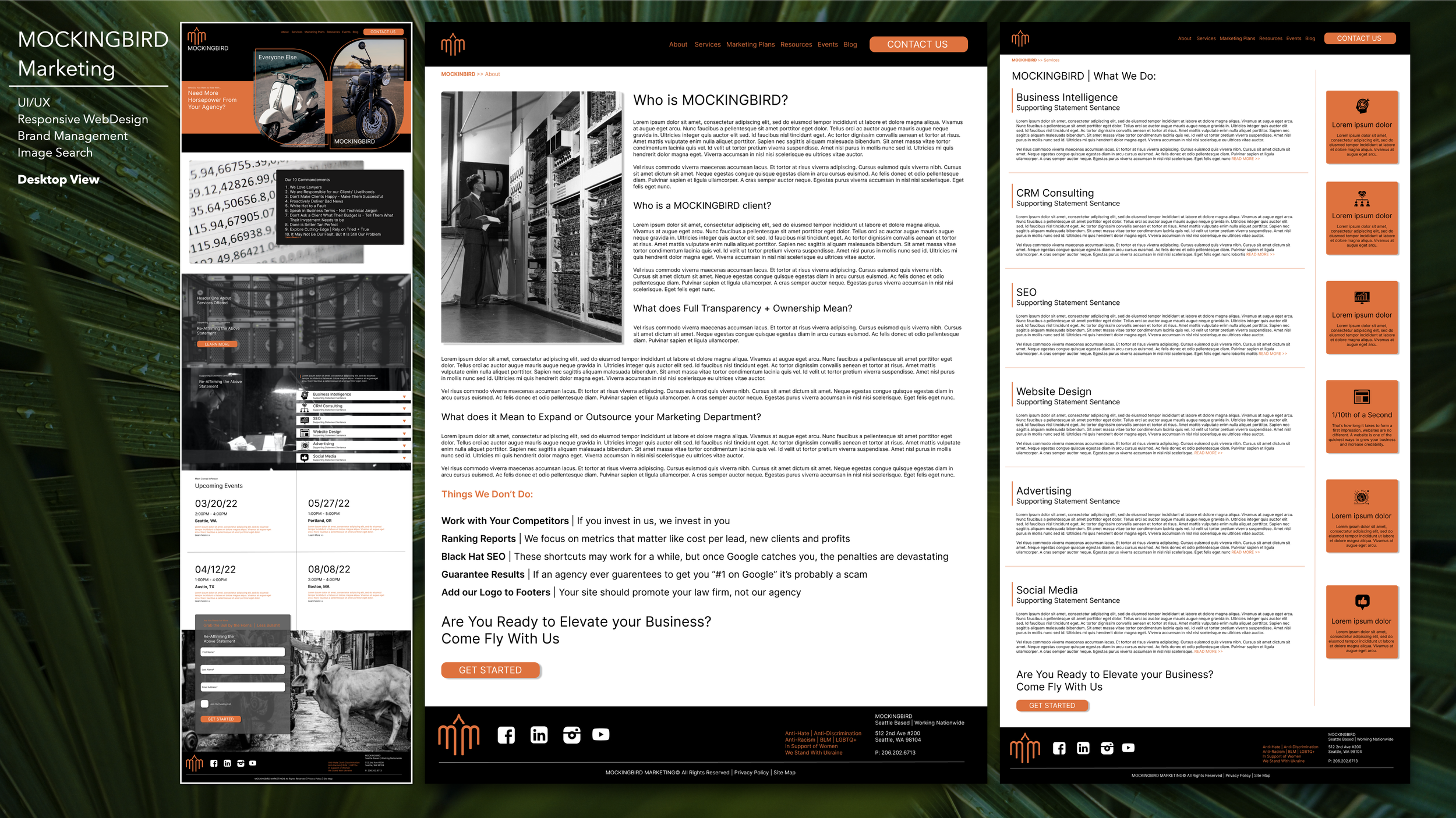
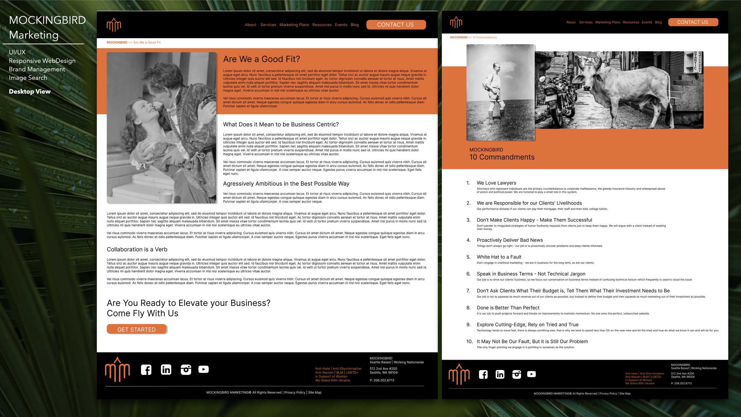
Bellow are the MOCKINGBIRD Desktop screens from the website redesign, enjoy!
Mobile First Design As a Best Practice
I always design with mobile first in mind, being your smallest piece of real-estate and often the most used/converted screen you have to make sure that your designs are aways being thought of in a mobile first lens. You need to make sure your copy doe not run too long, your visual story still tells its non verbal questions and that the user has just as captivating as an experience as they would on a full sized desktop. Buttons need to be to scale to still be clickable, ADA rules must apply and above all user experience must not suffer due to (lack of) size.
Bellow are my tablet and mobile screens for your viewing pleasure!
Brand Collateral + Ads |
Brand Collateral + Ads |


